


Cocoonの2.1.6から、いわゆるサイト型と呼ばれるトップページが簡単に作れるようになりました。
今までは、トップページを作るのは骨が折れるカスタマイズが必要だったんですが、Cocoonの設定でポチッポチッとするだけでトップページが完成します。
すごいぞCocoon!
で、トップページには「新着記事」+指定したカテゴリが表示できるようになります。
さらに、タブでかっこよく切り替えることも可能です。
そんなトップページですが、適用しているスキンにあわせてカスタマイズしたいところがどうしても出てくるので、そのあたりを紹介していこうかなと思います。
ちなみに、この記事では僕が作ったスキンのカスタマイズ方法を紹介しますが、他のスキンにも応用できるはずなので、試してみてください。
タブの背景色をスキンにあわせてカスタマイズする
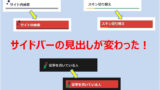
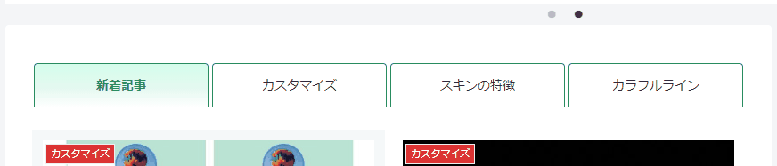
スキンを適用して、Cocoon設定の「インデックス」→「フロントページタイプ」で「タブ一覧」を設定すると、次のようなデザイになります。(下の画像はミックスグリーンの場合)

赤枠部分がタブの一覧部分になりますが、選択しているタブは背景が黒くなっているので、これをスキンのカラーに変更します。
次からは各スキンのCSSを紹介しますが、CSSは子テーマのstyle.cssに追加すればOKです。
追加の方法がわからない人は、次の記事を参考に追加してください。
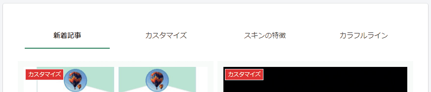
「カラフルライン」のCSS
カラフルラインのタブを、下の画像のようにカスタマイズするCSSです。

カスタマイズトップページ ※表示後、F5キーを押してください
#index-tab-1:checked~.index-tab-buttons .index-tab-button[for=index-tab-1],
#index-tab-2:checked~.index-tab-buttons .index-tab-button[for=index-tab-2],
#index-tab-3:checked~.index-tab-buttons .index-tab-button[for=index-tab-3],
#index-tab-4:checked~.index-tab-buttons .index-tab-button[for=index-tab-4] {
  background-image: repeating-linear-gradient(90deg,
    #b9d3e5 0%,#b9d3e5 50%,#bce4d2 50%,#bce4d2 100%);
  border:1px solid #b9d3e5;
  color:#1b4868;
}
.index-tab-buttons .index-tab-button {
  border-color: #b9d3e5;
  color:#1b4868;
}
「サムライブルー」のCSS
サムライブルー(勝色、無印)のCSS。

#index-tab-1:checked~.index-tab-buttons .index-tab-button[for=index-tab-1],
#index-tab-2:checked~.index-tab-buttons .index-tab-button[for=index-tab-2],
#index-tab-3:checked~.index-tab-buttons .index-tab-button[for=index-tab-3],
#index-tab-4:checked~.index-tab-buttons .index-tab-button[for=index-tab-4] {
  background: none #19295a;
  border:1px solid #19295a;
}
.index-tab-buttons .index-tab-button {
  border-color: #19295a;
}
「ダークスキン」のCSS
ダークスキンのCSS。
◯ダークエンジ

カスタマイズトップページ ※表示後、F5キーを押してください
#index-tab-1:checked~.index-tab-buttons .index-tab-button[for=index-tab-1],
#index-tab-2:checked~.index-tab-buttons .index-tab-button[for=index-tab-2],
#index-tab-3:checked~.index-tab-buttons .index-tab-button[for=index-tab-3],
#index-tab-4:checked~.index-tab-buttons .index-tab-button[for=index-tab-4] {
  background: none #84172f;
  border:1px solid #84172f;
  color:#f6f6f6;
}
.index-tab-buttons .index-tab-button {
  border-color: #84172f;
  color:#f6f6f6;
}
◯ダークルリ

カスタマイズトップページ ※表示後、F5キーを押してください
#index-tab-1:checked~.index-tab-buttons .index-tab-button[for=index-tab-1],
#index-tab-2:checked~.index-tab-buttons .index-tab-button[for=index-tab-2],
#index-tab-3:checked~.index-tab-buttons .index-tab-button[for=index-tab-3],
#index-tab-4:checked~.index-tab-buttons .index-tab-button[for=index-tab-4] {
  background: none #1b51ad;
  border:1px solid #1b51ad;
  color:#f6f6f6;
}
.index-tab-buttons .index-tab-button {
  border-color: #1b51ad;
  color:#f6f6f6;
}
◯ダークカモノハ

カスタマイズトップページ ※表示後、F5キーを押してください
#index-tab-1:checked~.index-tab-buttons .index-tab-button[for=index-tab-1],
#index-tab-2:checked~.index-tab-buttons .index-tab-button[for=index-tab-2],
#index-tab-3:checked~.index-tab-buttons .index-tab-button[for=index-tab-3],
#index-tab-4:checked~.index-tab-buttons .index-tab-button[for=index-tab-4] {
  background: none #075f66;
  border:1px solid #075f66;
  color:#f6f6f6;
}
.index-tab-buttons .index-tab-button {
  border-color: #075f66;
  color:#f6f6f6;
}
ミックススキンのカスタマイズは、以下の記事を参考にしてください。

タブのホバーでアニメーションをさせてみる
続いても、トップページでタブ一覧を設定した時のカスタマイズです。
タブにマウスを乗せた時(ホバー時)に、そのタブを浮かせたり、沈めたりするアニメーションを追加してみます。
タブのホバーでタブを沈めてみる
この場合のアニメーションは、次のようになります。
このホバーアニメーションのCSSは以下の通りです。
.index-tab-buttons {
  overflow: hidden;
}
#index-tab-1:checked~.index-tab-buttons .index-tab-button[for=index-tab-1],
#index-tab-2:checked~.index-tab-buttons .index-tab-button[for=index-tab-2],
#index-tab-3:checked~.index-tab-buttons .index-tab-button[for=index-tab-3],
#index-tab-4:checked~.index-tab-buttons .index-tab-button[for=index-tab-4] {
  position: relative;
  color: #298c60;
  top: 2px;
  border: none;
  border-top: 1px solid #298c60;
  border-right: 1px solid #298c60;
  border-left: 1px solid #298c60;
  background: linear-gradient(#d4fdeb 0% , #e6f9f1 60%, white 100%);
  border-radius: 0;
  border-top-left-radius: 4px;
  border-top-right-radius: 4px;
}
.index-tab-buttons .index-tab-button {
  position: relative;
  top: 2px;
  transition: .3s;
}
#index-tab-wrap .index-tab-buttons .index-tab-button {
  border: none;
  border-top: 1px solid #298c60;
  border-right: 1px solid #298c60;
  border-left: 1px solid #298c60;
  border-radius: 0;
  border-top-left-radius: 4px;
  border-top-right-radius: 4px;
}
.index-tab-buttons .index-tab-button:hover {
  position: relative;
  top: 10px;
}
このCSSでは、タブのボーダーや文字は緑(#298c60)を指定していますが、もちろん好きな色に変更できます。
また、選択中のタブのグラデーションの色(background: linear-gradientの部分)も適宜、好きな色に変更してください。
タブのホバーでタブを浮かせてみる
続いては、タブのホバーでタブが浮くアニメーションです。

このホバーアニメーションのCSSは以下の通りです。
.index-tab-buttons {
  overflow: hidden;
}

#index-tab-1:checked~.index-tab-buttons .index-tab-button[for=index-tab-1],
#index-tab-2:checked~.index-tab-buttons .index-tab-button[for=index-tab-2],
#index-tab-3:checked~.index-tab-buttons .index-tab-button[for=index-tab-3],
#index-tab-4:checked~.index-tab-buttons .index-tab-button[for=index-tab-4] {
  position: relative;
  color: #298c60;
  top: 2px;
  border: none;
  border-top: 1px solid #298c60;
  border-right: 1px solid #298c60;
  border-left: 1px solid #298c60;
  background: linear-gradient(#d4fdeb 0% , #e6f9f1 60%, white 100%);
  border-radius: 0;
  border-top-left-radius: 4px;
  border-top-right-radius: 4px;
}

.index-tab-buttons .index-tab-button {
  position: relative;
  top: 10px;
  transition: .3s;
}

#index-tab-wrap .index-tab-buttons .index-tab-button {
  border: none;
  border-top: 1px solid #298c60;
  border-right: 1px solid #298c60;
  border-left: 1px solid #298c60;
  border-radius: 0;
  border-top-left-radius: 4px;
  border-top-right-radius: 4px;
}

.index-tab-buttons .index-tab-button:hover {
  position: relative;
  top: 2px;
}
こちらも、タブのボーダーや文字の色(#298c60)、グラデーションを好きな色に変更してください。
タブのホバーでボトムのボーダーを表示させる
続いては、タブのホバーでボトムのボーダーを表示させるアニメーションです。
このホバーアニメーションのCSSは以下の通りです。
.index-tab-buttons .index-tab-button {
  position: relative;
}
#index-tab-wrap .index-tab-buttons .index-tab-button{
  border:none;
}
#index-tab-1:checked~.index-tab-buttons .index-tab-button[for=index-tab-1],
#index-tab-2:checked~.index-tab-buttons .index-tab-button[for=index-tab-2],
#index-tab-3:checked~.index-tab-buttons .index-tab-button[for=index-tab-3],
#index-tab-4:checked~.index-tab-buttons .index-tab-button[for=index-tab-4] {
  position: relative;
  border:none;
  background:none;
  color:#333;
}
#index-tab-1:checked~.index-tab-buttons .index-tab-button[for=index-tab-1]::before,
#index-tab-2:checked~.index-tab-buttons .index-tab-button[for=index-tab-2]::before,
#index-tab-3:checked~.index-tab-buttons .index-tab-button[for=index-tab-3]::before,
#index-tab-4:checked~.index-tab-buttons .index-tab-button[for=index-tab-4]::before {
  position: absolute;
  content: "";
  bottom: -2px;
  left: 12px;
  height: 2px;
  width: calc(100% - 24px);
  background-color: #298c60;
}
#index-tab-1:not(:checked) ~ .index-tab-buttons .index-tab-button[for="index-tab-1"]::before,
#index-tab-2:not(:checked) ~ .index-tab-buttons .index-tab-button[for="index-tab-2"]::before,
#index-tab-3:not(:checked) ~ .index-tab-buttons .index-tab-button[for="index-tab-3"]::before,
#index-tab-4:not(:checked) ~ .index-tab-buttons .index-tab-button[for="index-tab-4"]::before {
  position: absolute;
  content: "";
  bottom: -2px;
  left: 12px;
  width: 0px;
  height: 2px;
  background-color: #298c60;
  transition: .3s;
}
#index-tab-1:not(:checked) ~ .index-tab-buttons .index-tab-button[for="index-tab-1"]:hover::before,
#index-tab-2:not(:checked) ~ .index-tab-buttons .index-tab-button[for="index-tab-2"]:hover::before,
#index-tab-3:not(:checked) ~ .index-tab-buttons .index-tab-button[for="index-tab-3"]:hover::before,
#index-tab-4:not(:checked) ~ .index-tab-buttons .index-tab-button[for="index-tab-4"]:hover::before {
  height: 2px;
  width: calc(100% - 24px);
}
こちらも、ボーダーの色(#298c60)を好きな色に変更してください。
ちなみに、「transition: .3s;」の.3sは、アニメーションする時間が0.3秒という指定で、これを.6sなどのように大きい値を指定すると、ボーダー表示が「にゅっ」から「にゅー」に変わります。
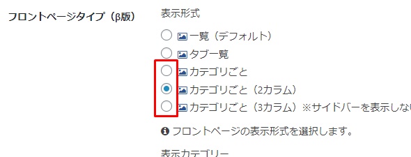
トップページのカテゴリー名をカスタマイズする
続いては、トップページのカテゴリー名をちょっとだけカスタマイズしてみます。
Cocoonの設定でトップページのタイプを以下のように「カテゴリ」を選択した場合のカテゴリー名のデザインを変更します。
標準では、カテゴリー名の両端に水平線がくっつきます。
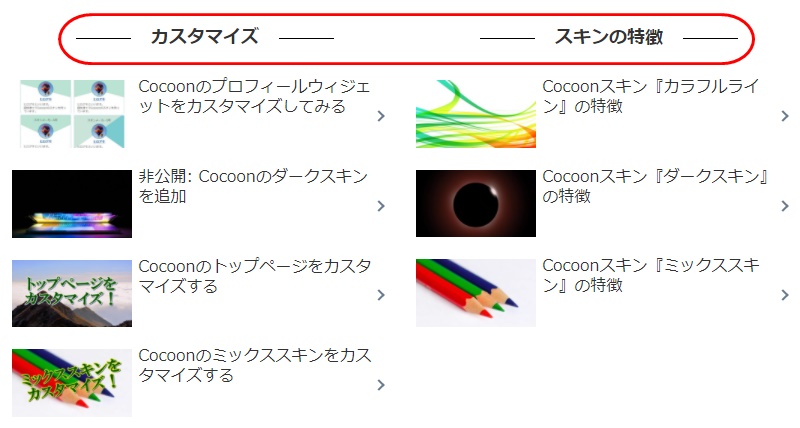
これを、下のように斜め線に変えてみます。
変更するCSSは以下の通り。
.list-title-in {
  padding: 0 50px;
}
.list-title-in:before, .list-title-in:after {
  width: 30px;
  height: 1px;
  background-color: black;
  transform: rotate(-60deg);
}
線の幅を変えたい場合はheightを、線の色を変えたい場合はbackground-colorを、変更してください。


コメント